 Fork on Github
Interfaces
UI Storia allows you to create interfaces for individual components or more complete pages.
You can work with Twig templates from your Symfony application or with local templates that will be used only for UI Storia.
To describe your interfaces, simply create a YAML file in the storia/components or storia/pages folder as follows:
# storia/components/progress.yaml

template: ui/progress.html.twig
variants:
    small:
        args:
            height: 1.5

    default:
        args:
            height: 2.5

    large:
        args:
            height: 4

    extra_large:
        args:
            height: 6
The difference between the storia/components folder and the storia/pages folder is as follows:
By convention, use the storia/components folder for interfaces related to macro components and the storia/pages folder for interfaces for more complete pages.
Here's the configuration details:
template: Corresponds to the path to the Twig template of your Symfony application that you want to work with.variants: This is the list of different variants you want to create.
Template / Component
The template key is optional because you can also use a Twig template at the same level and with the same name as your YAML file.
For example, for your YAML file storia/components/progress.yaml, you can create a file storia/components/progress.html.twig and this file will be used by UI Storia.
UI Storia also provides native support for Twig Component for your interfaces. To do this, simply replace the template key with the component key as shown below:
# storia/components/button.yaml

component: Button
variants:
    plain:
        args:
            class: plain
            label: Plain button

    outline:
        args:
            class: outline
            label: Outline button
Form Types
UI Storia provides native support for Symfony Form Types, allowing you to preview and test form fields in isolation.
To work with a Form Type, use the form key instead of template or component:
# storia/components/form/text.yaml

form: Symfony\Component\Form\Extension\Core\Type\TextType
# storia/components/form/choice.yaml
form: Symfony\Component\Form\Extension\Core\Type\ChoiceType
options:
choices:
'In Stock': true
'Out of Stock': falseAutomatic Variants
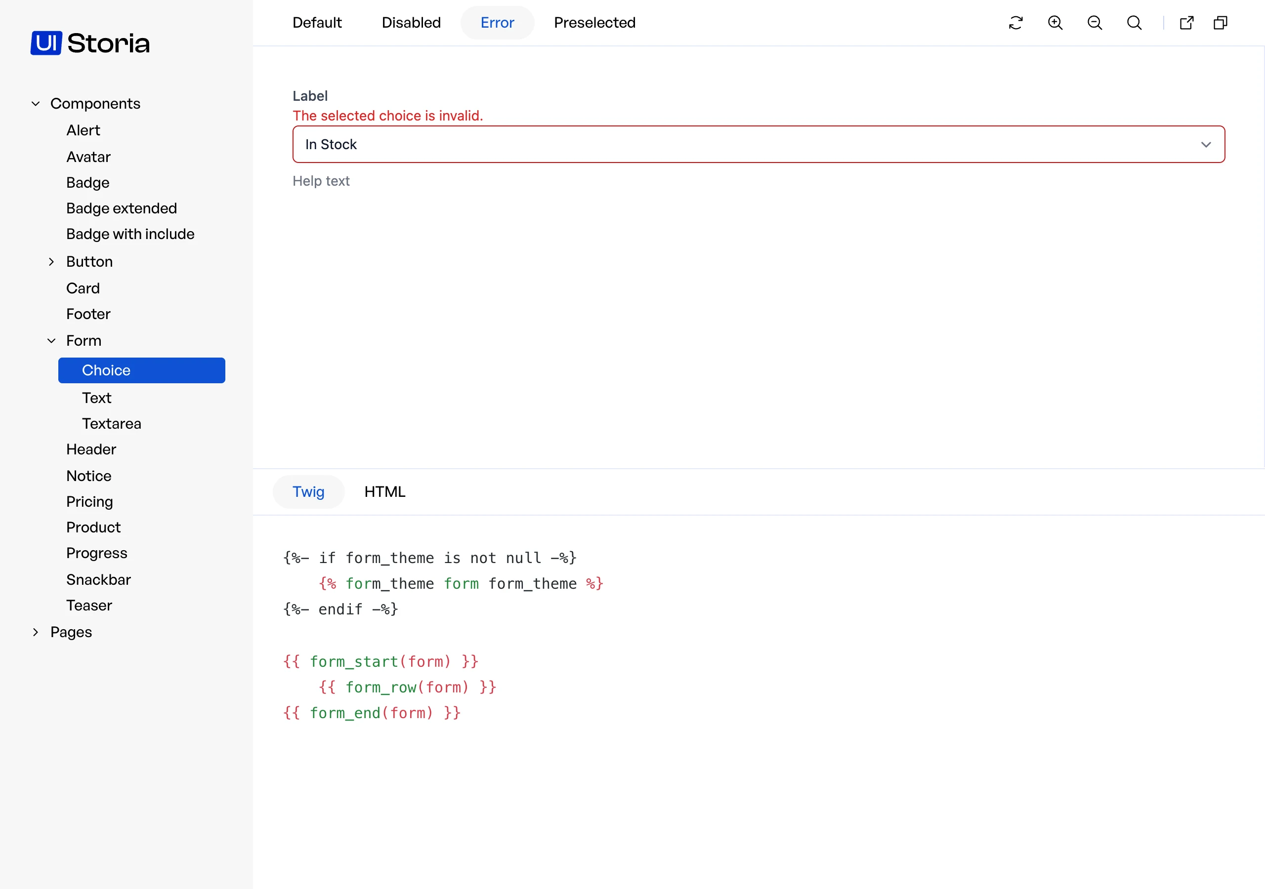
When using the form key, UI Storia automatically generates three variants for you:
- default: The form field in its normal state
- disabled: The form field with
disabled: trueoption - error: The form field with a validation error displayed
Custom Variants
Declare your own variants with the variants key. They are added after the three automatic ones, and a variant with the same name as an automatic one replaces it.
A variant of a form accepts two keys instead of args and blocks:
options: Form options merged over the globaloptionsof the file. The variant wins.with_errors: Set it totrueto display a validation error.
# storia/components/form/choice.yaml

form: Symfony\Component\Form\Extension\Core\Type\ChoiceType
options:
    choices:
        'In Stock': true
        'Out of Stock': false
variants:
preselected:
options:
data: true
unavailable:
options:
data: false
disabled: trueOptions
The options key allows you to pass options to your Form Type constructor, just like you would when creating a form in Symfony:
# storia/components/form/email.yaml

form: Symfony\Component\Form\Extension\Core\Type\EmailType
options:
    required: false
    attr:
        placeholder: 'Enter your email'
Form Theme
You can also specify a custom form theme for rendering your form field using the form_theme key:
# storia/components/form/custom.yaml

form: App\Form\CustomType
form_theme: 'forms/custom_theme.html.twig'
options:
label: 'Custom Field'Variants
The variants key lists the different variations of your interface, passing different arguments to your template.
Each variant is described with a name (which can be overridden as shown in the example below) and an array of arguments called args.
Twig Component support also brings a blocks key to configure HTML blocks that will be passed to your component.
# storia/components/button.yaml

component: Button
variants:
    plain:
        args:
            class: plain
        blocks:
            content: Plain button
            svg: '<svg xmlns="http://www.w3.org/2000/svg" xml:space="preserve" width="200" height="200" viewBox="0 0 42 42"><path d="M42 20H22V0h-2v20H0v2h20v20h2V22h20z"/></svg>'

    outline:
        name: My outline button
        args:
            class: outline
        blocks:
            content: Outline button
svg: '<svg xmlns="http://www.w3.org/2000/svg" xml:space="preserve" width="200" height="200" viewBox="0 0 42 42"><path d="M42 20H22V0h-2v20H0v2h20v20h2V22h20z"/></svg>'Advanced: include and extends
To share data between views, prefer named data. include: and extends: are advanced features meant for sharing YAML structure.
UI Storia supports two directives to avoid duplication across your YAML files: include: for sharing anchor definitions, and extends: for inheriting and overriding a complete configuration.
include: — Shared anchor definitions
The include: directive lets you define YAML anchors in a shared file and reuse them across multiple configuration files.
Create a shared file anywhere in your storia/ folder (conventionally prefixed with _ to indicate it is not a standalone view):
# storia/_shared.yaml

_definitions:
    default_badge: &default_badge
        class: bg-blue-100 text-blue-800 text-xs font-medium px-2.5 py-0.5 rounded

    large_badge: &large_badge
        class: bg-blue-100 text-blue-800 text-sm font-medium px-2.5 py-0.5 rounded
Then include it from any configuration file using include: and reference the anchors with the standard YAML * syntax:
# storia/components/badge.yaml

include: _shared

template: ui/badge.html.twig
variants:
    default:
        args:
            <<: *default_badge

    large:
        args:
            <<: *large_badge
You can include multiple files using a list:
include: [_colors, _sizes]

# or equivalently:
include:
    - _colors
- _sizesextends: — Configuration inheritance
The extends: directive allows a configuration file to inherit all settings from a parent file and selectively override only the parts that differ.
# storia/components/badge.yaml

template: ui/badge.html.twig
variants:
    default:
        args:
            class: bg-blue-100 text-blue-800 text-xs font-medium px-2.5 py-0.5 rounded
    large:
        args:
            class: bg-blue-100 text-blue-800 text-sm font-medium px-2.5 py-0.5 rounded
    bordered:
        args:
            class: bg-blue-100 text-blue-800 text-xs font-medium px-2.5 py-0.5 rounded border border-blue-400
# storia/components/badge-red.yaml
extends: components/badge
variants:
default:
args:
class: bg-red-100 text-red-800 text-xs font-medium px-2.5 py-0.5 rounded
large:
args:
class: bg-red-100 text-red-800 text-sm font-medium px-2.5 py-0.5 roundedIn this example, badge-red.yaml inherits the template key and the bordered variant from the parent, and only overrides default and large.
The merge is deep: nested keys (like args within a variant) are merged individually, so you can override a single argument without redefining all the others.
Extensions can be chained — a file that uses extends: can itself be extended by another file.
Notes
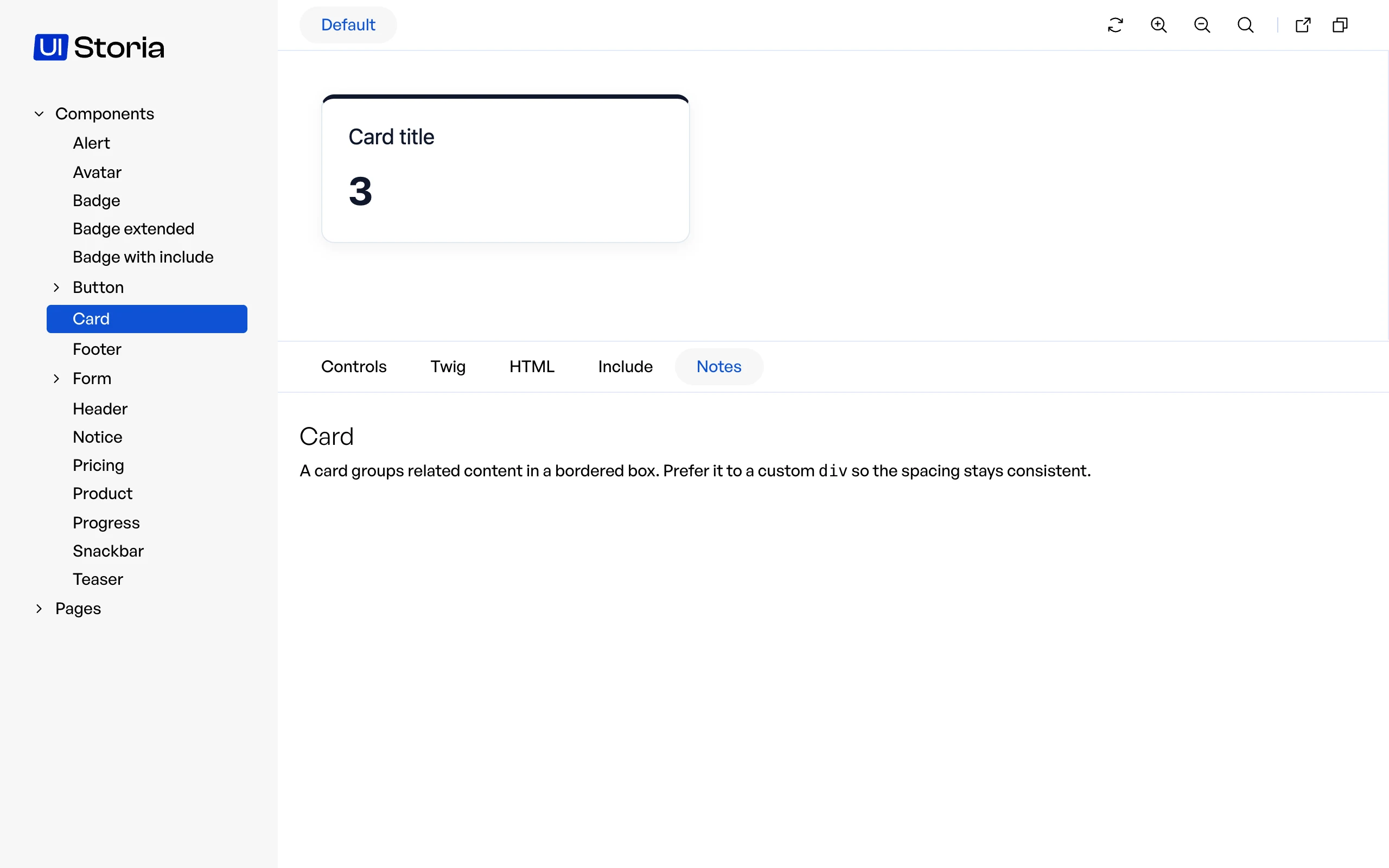
A Markdown file next to the YAML file, with the same name, becomes the Notes tab of the view. Use it to document the component: when to use it, accessibility rules, links to the design.
storia/components/button/button.yaml
storia/components/button/button.md
The file is rendered as HTML, and the tab only appears when the file exists.