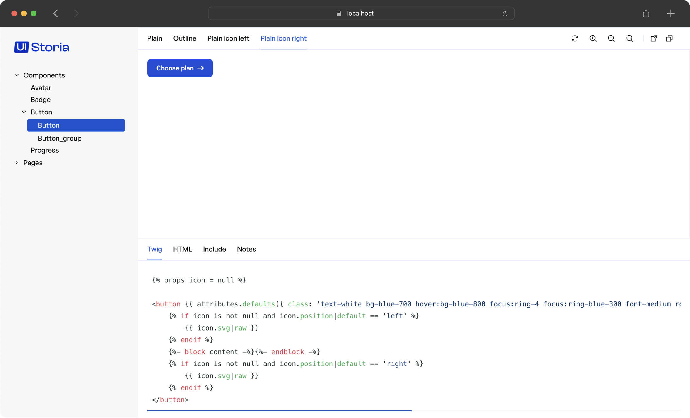

Designed to simplify and speed up the development process of UI by providing a visual and modular development environment in your Symfony application.

Unlike Fractal or StoryBook, which rely on a port of Twig to JS for Symfony projects, UI Storia allows direct work on project templates, thus enabling the safe use of the latest Twig features available.

Add iq2i/storia-bundle to your composer.json file:
composer require iq2i/storia-bundleIf you are using Symfony Flex, the following steps should be done automatically. Otherwise, follow the instructions.
Inside config/bundles.php, add the following line:
// config/bundles.php

return [
    // ...
    IQ2i\StoriaBundle\IQ2iStoriaBundle::class => ['all' => true],
];Create a new routing file to add UI Storia's routes:
# config/routes/is2i_storia.yaml
iq2i_storia:
    resource: '@IQ2iStoriaBundle/config/routes.php'
    prefix: '/storia'
Create the storia folder at the root of your project, with two subfolders: components and pages.
By default, UI Storia will try to read YAML files in the storia folder at the root of your application.
You can change this behavior by creating a configuration file config/packages/iq2i_storia.yaml with the following content:
# config/packages/iq2i_storia.yaml

iq2i_storia:
    default_path: '%kernel.project_dir%/new-folder'
It is also possible, from this same file, to enable or disable the bundle (specifically to condition its routes) with a configuration parameter:
# config/packages/iq2i_storia.yaml

iq2i_storia:
    # use an environment variable for easier configuration
    enabled: '%env(IQ2I_STORIA_ENABLED)%'
UI Storia will render your interfaces without CSS or JavaScript.
To instruct UI Storia to use your styles and scripts, simply override the iframe.html.twig template following the Symfony documentation:
{# templates/bundles/IQ2iStoriaBundle/iframe.html.twig #}

{% extends '@!IQ2iStoria/iframe.html.twig' %}

{# if you use WebpackEncoreBundle #}
{% block stylesheets %}
    {{ encore_entry_link_tags('app') }}
{% endblock %}
{% block javascripts %}
   {{ encore_entry_script_tags('app') }}
{% endblock %}

{# if you use AssetMapper #}
{% block javascripts %}
   {% block importmap %}{{ importmap('app') }}{% endblock %}
{% endblock %}UI Storia allows you to create interfaces for individual components or more complete pages.
You can work with Twig templates from your Symfony application or with local templates that will be used only for UI Storia.
To describe your interfaces, simply create a YAML file in the storia/components or storia/pages folder as follows:
# storia/components/progress.yaml

template: ui/progress.html.twig
variants:
    small:
        args:
            height: 1.5

    default:
        args:
            height: 2.5

    large:
        args:
            height: 4

    extra_large:
        args:
            height: 6
The difference between the storia/components folder and the storia/pages folder is as follows:
By convention, use the storia/components folder for interfaces related to macro components and the storia/pages folder for interfaces for more complete pages.
Here's the configuration details:
template: Corresponds to the path to the Twig template of your Symfony application that you want to work with.variants: This is the list of different variants you want to create.The template key is optional because you can also use a Twig template at the same level and with the same name as your YAML file.
For example, for your YAML file storia/components/progress.yaml, you can create a file storia/components/progress.html.twig and this file will be used by UI Storia.
UI Storia also provides native support for Twig Component for your interfaces. To do this, simply replace the template key with the component key as shown below:
# storia/components/button.yaml

component: Button
variants:
    plain:
        args:
            class: plain
            label: Plain button

    outline:
        args:
            class: outline
label: Outline buttonUI Storia provides native support for Symfony Form Types, allowing you to preview and test form fields in isolation.
To work with a Form Type, use the form key instead of template or component:
# storia/components/form/text.yaml

form: Symfony\Component\Form\Extension\Core\Type\TextType
# storia/components/form/choice.yaml
form: Symfony\Component\Form\Extension\Core\Type\ChoiceType
options:
choices:
'In Stock': true
'Out of Stock': falseWhen using the form key, UI Storia automatically generates three variants for you:
disabled: true optionYou cannot define custom variants for form types - these three variants are provided automatically.
The options key allows you to pass options to your Form Type constructor, just like you would when creating a form in Symfony:
# storia/components/form/email.yaml

form: Symfony\Component\Form\Extension\Core\Type\EmailType
options:
    required: false
    attr:
placeholder: 'Enter your email'You can also specify a custom form theme for rendering your form field using the form_theme key:
# storia/components/form/custom.yaml

form: App\Form\CustomType
form_theme: 'forms/custom_theme.html.twig'
options:
label: 'Custom Field'The variants key lists the different variations of your interface, passing different arguments to your template.
Each variant is described with a name (which can be overridden as shown in the example below) and an array of arguments called args.
Twig Component support also brings a blocks key to configure HTML blocks that will be passed to your component.
# storia/components/button.yaml

component: Button
variants:
    plain:
        args:
            class: plain
        blocks:
            content: Plain button
            svg: '<svg xmlns="http://www.w3.org/2000/svg" xml:space="preserve" width="200" height="200" viewBox="0 0 42 42"><path d="M42 20H22V0h-2v20H0v2h20v20h2V22h20z"/></svg>'

    outline:
        name: My outline button
        args:
            class: outline
        blocks:
            content: Outline button
svg: '<svg xmlns="http://www.w3.org/2000/svg" xml:space="preserve" width="200" height="200" viewBox="0 0 42 42"><path d="M42 20H22V0h-2v20H0v2h20v20h2V22h20z"/></svg>'UI Storia provides an Argument Resolver feature that allows you to dynamically generate arguments by calling PHP methods directly from your YAML configuration files.
Instead of hardcoding values in your variant arguments, you can reference a PHP class method using the syntax ClassName::methodName. UI Storia will automatically detect this pattern and call the method to generate the argument value.
The Argument Resolver supports both:
# storia/components/product.yaml

component: Product
variants:
    default:
        args:
            product: App\Factory\ProductFactory::createDefault
        blocks:
            content: ''

    expensive:
        args:
            product: App\Factory\ProductFactory::createExpensive
        blocks:
            content: ''

    outOfStock:
        args:
            product: App\Factory\ProductFactory::createOutOfStock
        blocks:
            content: ''

    static:
        args:
            product:
                id: 99
                name: Static Product
                price: 19.99
                inStock: true
        blocks:
            content: ''
In this example, the first three variants use the Argument Resolver to call methods from ProductFactory, while the static variant uses hardcoded values.
The ProductFactory class could look like this:
<?php

namespace App\Factory;

class ProductFactory
{
    public static function createDefault(): array
    {
        return [
            'id' => 1,
            'name' => 'Default Product',
            'price' => 29.99,
            'inStock' => true,
        ];
    }

    public static function createExpensive(): array
    {
        return [
            'id' => 2,
            'name' => 'Premium Product',
            'price' => 199.99,
            'inStock' => true,
        ];
    }

    public static function createOutOfStock(): array
    {
        return [
            'id' => 3,
            'name' => 'Sold Out Product',
            'price' => 49.99,
            'inStock' => false,
        ];
    }
}